For the course Business Development Lab a team decided to create an app for finding bars, pubs or other places with cheap beers. They aim to engage mostly students, since they have a more adjusted budget so they would require this kind of information. One member of the team asked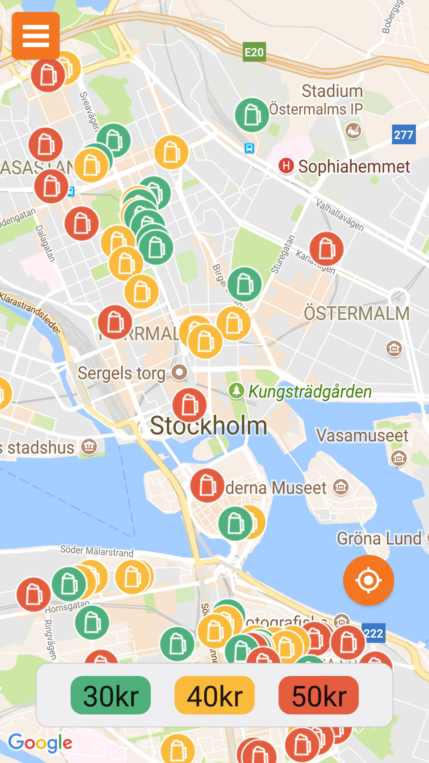 for my opinion about the app so I decided to blog about it as well.
The app is called Near to beer, and is still on the development stage. They have a testing version for android that is the one I tried. This version has the basic functionality: a maps showing all the places where beer is bein sold in stockholm, and three buttons for selecting three different price filters (30, 40 and 50 kronor). For it uses google maps showing the places with a beer icon with different colors according to the price of the beer in it. This map can be zoomed, rotated, etc. in the same way than the google maps app. Once the icon is pressed it will show a small section with info about the place: the name, description,the distance from your own position, etc.
The second screen is the feedback one and it can be accesed directly pressing the orange button in the upper- left corner. This makes a whole new screen appear with a small form por sending feedback, suggestion or prices updates.
As we can see, the app is pretty basic (for now at least) but it complies with its objective that is showing the places with the cheapest prices. Considering this I analized it, using the Nielsen’s 10 general principles for 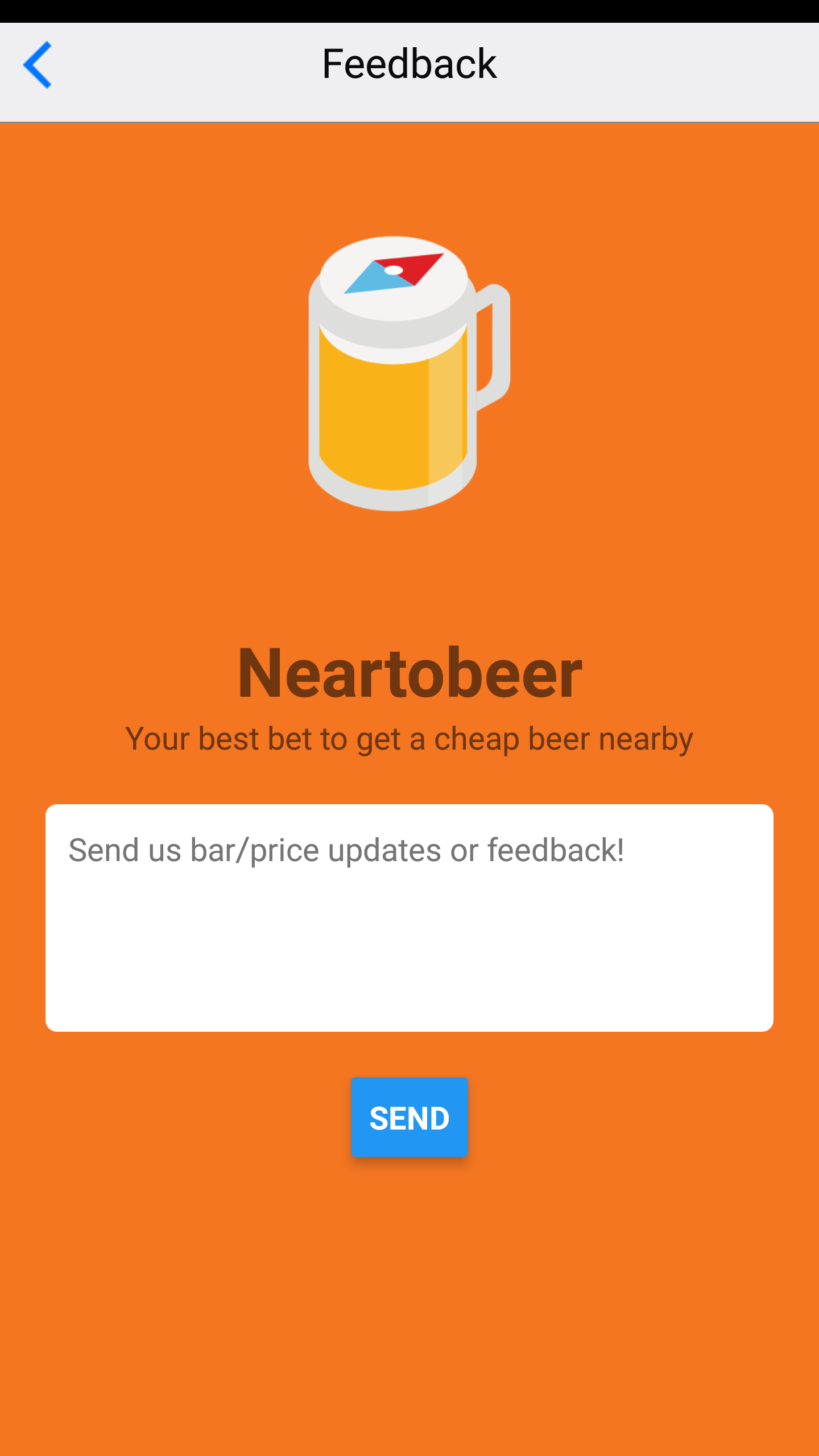 interaction design, for highlighting some components that could be changed/improved for better interaction with the user.
The first thing I noticed it is that the filters can’t be chosen just by itselves. When selecting the 50 kronor places the app automatically choses the 30, 40 and 50 kronor too, showing basically every place. This can fullfill the whole screen making it more difficult to read the map. Even though, I like the way of having buttons instead of slider as a filter (as many other apps have) because makes the design more minimalistic.
Another problem (or feature) it is when someone wants to see the description of a place, it is necessary to drag the information screen to the top of the display and keep it there for showing the information, making it more difficult to read if the text is long. Just pressing the icon once for showing the information would be a better option.
In general terms the usability and speed are good, and the app it is intuitive and easy to understand. However I would like to give some suggestions as well for improving the experience. In the description doesn’t appear the opening times neither a star rating or something similar. That info could be get from google places, foursquare, etc. and it would help a lot at the moment of chosing. In the same line I would add a filter for the time, allowing the user to see the places that are open at the exact same moment or during or the times of the day. In this way the user doesn’t need to check every place and its description for knowing if the place is open. Another interesting feature would be to search just in the place being showed in the map, because the user could not be planning on seeing the places on the whole map and just be interested in certain areas.
For concluding, i would say the app looks really interesting and has potential for becoming something bigger. Maybe it would be necessary to add some extra features like discounts for frequent users, the option of checking the most crowded places or the ones more chosen, connection to social networks, etc. for turning the system from one use app into a multiple use one user thus becoming a more interesting business for developing.
Pingback: thc free cannabis oil
Pingback: mơ cãi nhau đánh con gì
Pingback: Köp OxyContin I sverige
Pingback: grandpashabet